ILGA -Europe: institutional and vibrant
ILGA-Europe is the largest association for the rights of LGBTI people in Europe.
With more than 500 member organizations, it is strategically based in Brussels, right at the heart of decision-making in the European Union.
In the beginning of 2021, the association opened a call for the creation of their new website. SOLOS, with an already great experience in NGO website development, was chosen among dozens of applications for this NGO’s website development.
Two very clear principles guided our work on this brand: the LGBTI positioning and the institutional weight of the structure, that had necessarily to be transposed in this NGO’s website development.
We undertook a solid initial research work in order to achieve the best final result in this NGO’s website development. A statistical and qualitative analysis, which included an internal survey for feedback on the needs felt by the association’s team, together with an international benchmark, led to an essential report that laid the foundations for the design of both the website’s navigation concept and architecture.
One of the biggest challenges we faced during this NGO’s website development was the difference between the main audiences accessing the website: one sought generic information and the other searched for very specific materials, such as legislation or documentation.
To serve both, in this NGO’s website development we’ve based the website’s architecture in an advanced search system and a very well defined information hierarchy system between categories, labels and types of information.
In this project, accessibility has always been a priority, both through the use, for example, of chromatic pallets for people with color blindness, as well as in the structure and construction of the website, which has a specific vertical accessibility menu.
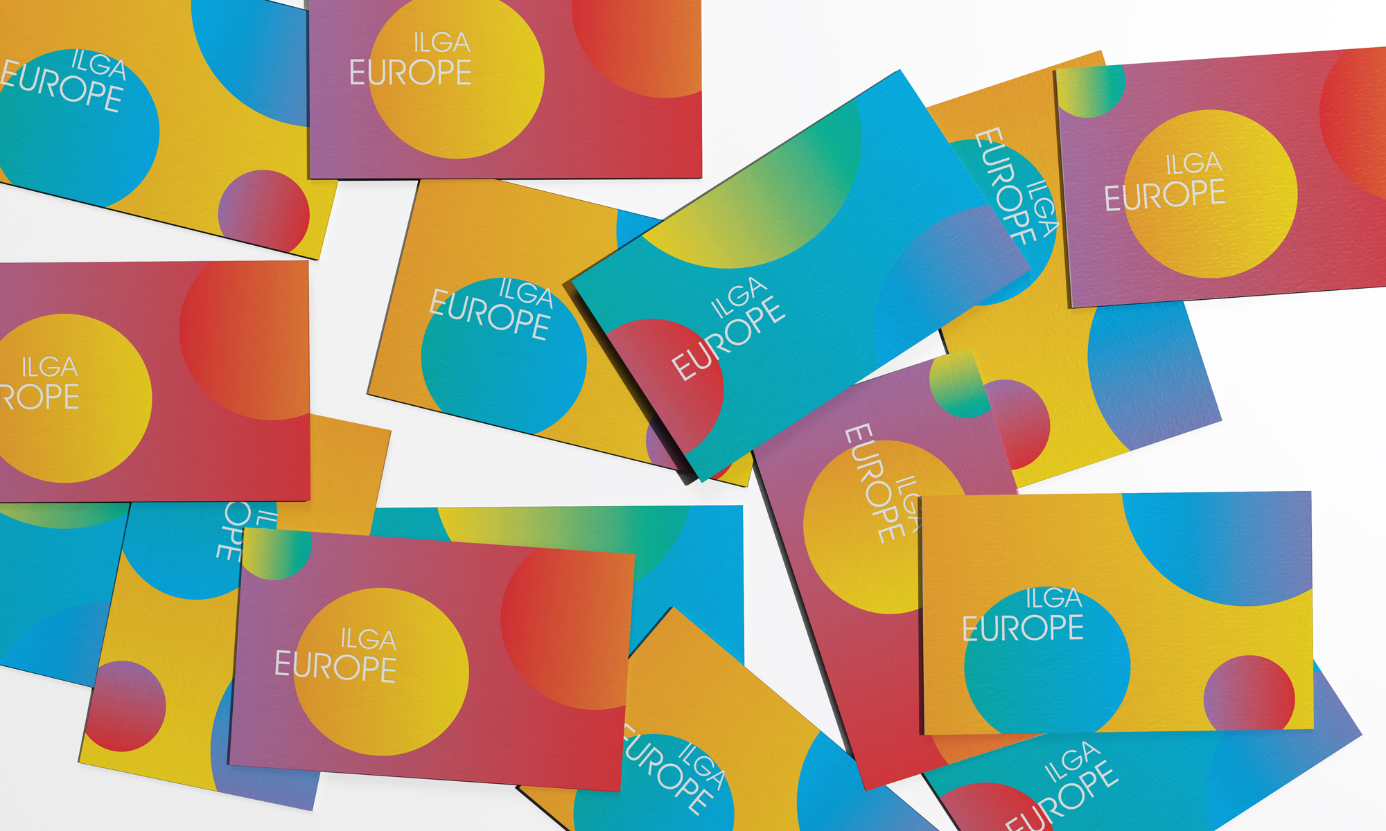
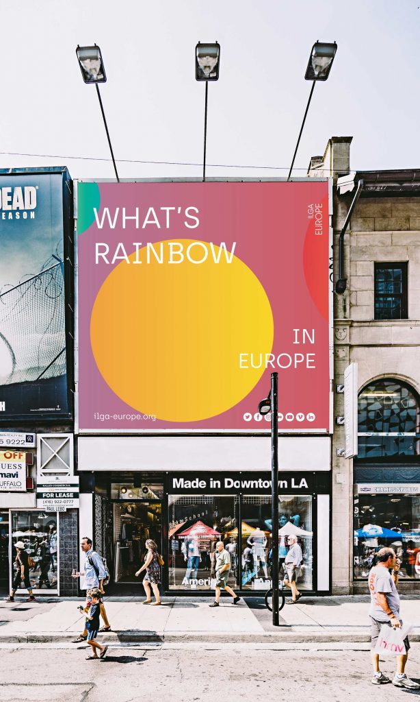
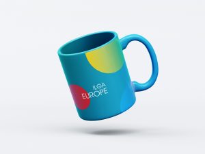
As for the brand’s visual universe, we selected a smooth color palette, in which black and white stand out, but with color here and there, that was applied in the NGO website development too.
The work we’ve developed on the brand’s visual universe within the NGO website development ended up redefining the image of the brand itself and its merchandising.
Based on the rainbow colors of the LGBTI flag, the solution defined for the NGO website development was a fluid colors and gradients palette, but also restrained to match the institutional character, with a typography focused on black and white and color taking its place in some moments, types of content and punctual animations – a combination of elements that ended up creating a brand identity that didn’t exist before.