ILGA Portugal: the new website as an explosion of color
ILGA Portugal is the oldest and most geographically representative association working for the rights of LGBTI people in our country.
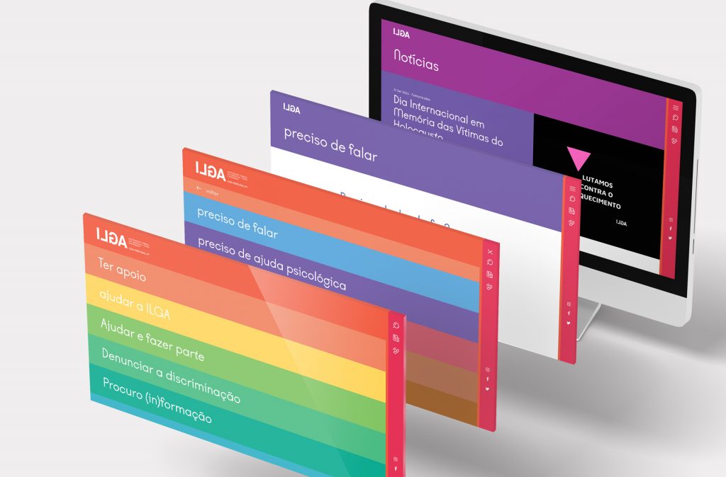
They contacted SOLOS looking for a new website; in the end, not only did ILGA get an epicenter of information about its work that exceeded all expectations, but it also got a design system, identified as fundamental to the brand’s positioning.
Vibrant, striking, agile and assertive – these are the adjectives that best describe the final result delivered by SOLOS to ILGA Portugal.
A visit to the website makes it clear why:
— it has a very striking identity (an asset for the brand)
— the bright colors make it very attractive
— and the navigation and information structure are very agile and assertive.
Unlike the previous website, the new platform is optimized for mobile browsing – the device most used by users.
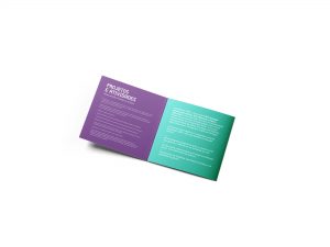
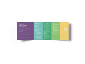
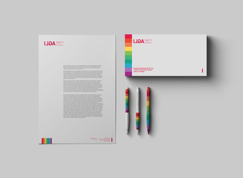
After the website’s information architecture was developed, we began building the brand’s visual universe.
This universe (something never before created for ILGA Portugal) enhanced the creativity and design of the website, but above all, it introduced a level of reflection and conceptualization that enables the brand to evolve and scale consistently.
Keeping the logo, we created the brand’s color palette and gradients, as well as the typography. We also defined the hierarchy of graphic and iconographic elements for ILGA Portugal’s structure of services, groups and areas of action. The association’s central action services were also given their own logos, based on the iconography selected for the visual universe.